What is the UFC?
UFC or Ultimate Fighting Championship is an MMA organization that has revolutionized the world of combat sports. Established in 1993, the UFC has become synonymous with mixed martial arts, showcasing some of the most skilled and determined athletes from around the globe. The UFC has evolved into a modern spectacle, combining elements of striking, grappling, and wrestling. Unlike traditional boxing, UFC fights allow competitors to utilize a wide array of techniques, including punches, kicks, elbow strikes, knee strikes, and submissions. As we delve into the realm of tech-driven analysis of UFC fights data, it’s essential to understand the foundation and significance of this dynamic sport.
Let’s go through the main points of analysis that we will be covering:
Fights Per-Year Analysis:
- Analyzing the number of fights per year from 2010 to 2020.
- Plotting the trends over the years.
- Further breaking down the analysis by gender (Male and Female).
Underdog and Upset Analysis:
- Identifying underdogs based on betting odds.
- Calculating the percentage of upsets (when underdogs win) in fights.
- Visualizing the upset percentages over different years and weight classes.
- Exploring whether upsets are more common in title fights.
Location-based Analysis:
- Determining locations with the most upsets since 2010.
- Investigating upset percentages by country and city.
While working on this project, I asked myself: What is the difference between predicting results and analyzing possible outcomes? Are they the same? What is a prediction in data versus an analysis of past data?
Prediction vs Analysis
Prediction in data refers to using historical data and statistical algorithms to forecast future events or trends. It involves identifying patterns and relationships within the data and using this information to make educated guesses about what may happen next. Predictive modeling techniques, such as regression analysis, machine learning algorithms, and time series forecasting, are commonly employed to make predictions.
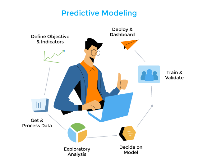
On the other hand, analyzing past data involves examining historical information to gain insights into what has already occurred. This analysis can help uncover:
- Trends
- Patterns
- Correlations
These may provide valuable insights into the factors influencing certain outcomes. However, it’s important to note that analyzing past data does not guarantee future accuracy. There may be unforeseen variables or changes in circumstances that can impact future outcomes. It helps in understanding the characteristics of the dataset and making informed decisions based on observed patterns.
Conclusion
While both analysis and prediction are essential components of data science, they serve different purposes and require distinct approaches. Analysis provides the foundation for understanding data, uncovering patterns, and generating insights. Prediction leverages these insights to forecast future events, enabling data-driven decision-making and strategic planning. By distinguishing between these two processes, data professionals can effectively communicate their findings and recommendations, ensuring clarity and precision in their work.
Let’s get to work!
Step 1: Collecting the data
The first step to making this analysis is to gather the information from, in this case, only one source, Kaggle. However, you might find yourself gathering data from several different sources.
 Go to Kaggle and look for “UFC Fights (2010 – 2020) with Betting Odds” dataset.
Download the csv file and save it in a repository for the project. It is good practice to start this kind of project with an organized approach. Define which folder you will be using and divide it into separate folders for code, files, notes, etc. This way, when you find yourself working on bigger projects, you will have some practice to help you stay organized.
Step 2: Initialize your IDE project
To begin with, I will be using Visual Studio Code as my preferred Integrated Development Environment (IDE). Over the years, I’ve found it to be reliable and feature-rich, making it my go-to choice for coding tasks. Visual Studio Code provides a comfortable environment for development, offering various features that streamline the coding process.
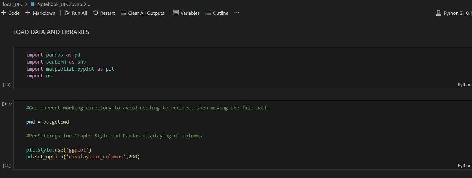
After setting up the project repository, which I’ve named “local_UFC” in my case, the next step is to create a Jupyter Notebook file. Make sure you have all the dependencies needed for the project before starting, so you don’t find yourself interrupted along the way.
Installing Jupyter Notebook is straightforward. If you haven’t already done so, you can follow these steps:
- Ensure you have Python installed on your system.
- Open your command prompt or terminal.
- Run the command
pip install jupyter. - Once installed, you can start Jupyter Notebook by running the command
jupyter notebookin your terminal.
As for the libraries, I’ve chosen to work with Pandas, Seaborn, and Matplotlib. These libraries are excellent choices for data analysis in Python. While Pandas provides powerful data manipulation capabilities, Seaborn and Matplotlib offer versatile options for data visualization.
In the code, you’ll notice that I’ve imported the os module. This module provides functions for interacting with the operating system and managing file paths.
In the second cell of the code, I’ve utilized the os.getcwd() function to retrieve the current working directory. This ensures that the code remains robust even if the directory is moved from its original source. Additionally, the os module offers various other functionalities, such as creating or deleting directories and checking file existence, which can be explored further depending on the project’s requirements.
Step 3: Define the DataFrame
DataFrame is a 2-dimensional labeled data structure with columns of potentially different types. You can think of it like a spreadsheet or SQL table, or a dict of Series objects. It is generally the most commonly used panda’s object.

First, I am defining a Python function called load_dataset() to encapsulate the DataFrame (df) within a function. By using the argument pd.read_csv("Data - UFC.csv"), pandas accesses the file in my local repository and stores the data in the DataFrame. We then call the function and store its value in a df within the Jupyter Notebook. This way, if we need to change the data we are loading, we won’t have to manually update it every time we use the df.
Step 4: Understanding the Data
There is a term called EDA, which stands for “Exploratory Data Analysis.” EDA is not a formal process with a strict set of rules; more than anything, EDA is a state of mind. During the initial phases of EDA, you should feel free to investigate every idea that occurs to you. Some of these ideas will pan out, and some will be dead ends. As your exploration continues, you will home in on a few particularly productive areas that you’ll eventually write up and communicate to others.
For more info: 7 Exploratory Data Analysis | R for Data Science (had.co.nz)
EDA is an important part of any data analysis, even if the questions are handed to you on a platter, because you always need to investigate the quality of your data.
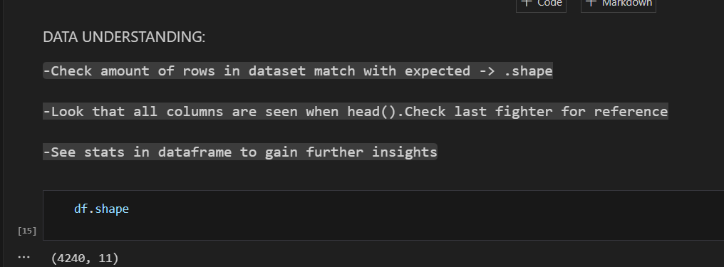
During EDA, your goal is to develop an understanding of your data. The easiest way to do this is to use questions as tools to guide your investigation. When you ask a question, it focuses your attention on a specific part of your dataset and helps you decide which graphs, models, or transformations to apply.
The key to asking questions is to generate a large number of them. It’s difficult to ask revealing questions at the start of your analysis because you don’t yet know what insights are contained in your dataset. However, each new question you ask will expose you to a new aspect of your data and increase your chance of making a discovery.
The df.shape attribute allows you to see the number of columns and rows your dataframe has.
DataFrame.info(verbose=None, buf=None, max_cols=None, memory_usage=None, show_counts=None)
(Print a concise summary of a DataFrame).
Parameters: verbose: bool, optional (Whether to print the full summary.)
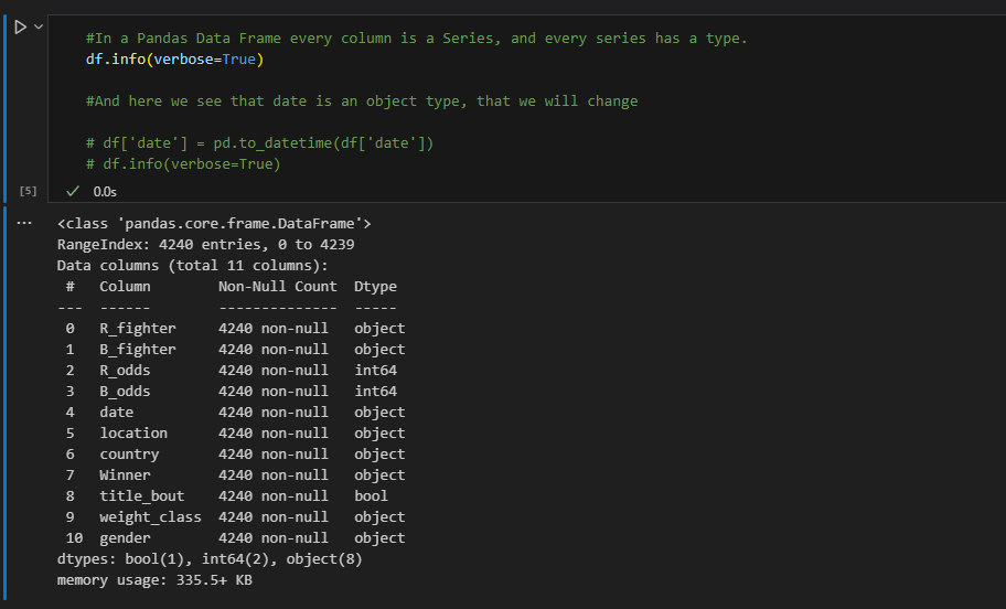
After reviewing the summary of our data, pay attention to the Dtype (data type) of the column data. It appears to be an object, which might not be ideal for our analysis. It would be better if the data type were converted to date for our purposes.
-To access specific columns, you can type df['your_column'].
-To change the data type of a column, there are several predefined options available.
pandas.to_datetime(arg, errors='raise', dayfirst=False, yearfirst=False, utc=False, format=None, exact=_NoDefault.no_default, unit=None, infer_datetime_format=_NoDefault.no_default, origin='unix', cache=True)
(Convert argument to datetime).
Parameters:
arg: int, float, str, datetime, list, tuple, 1-d array, Series, DataFrame/dict-like
The object to convert to a datetime. If aDataFrameis provided, the method expects minimally the following columns:"year","month","day". The column “year” must be specified in 4-digit format.
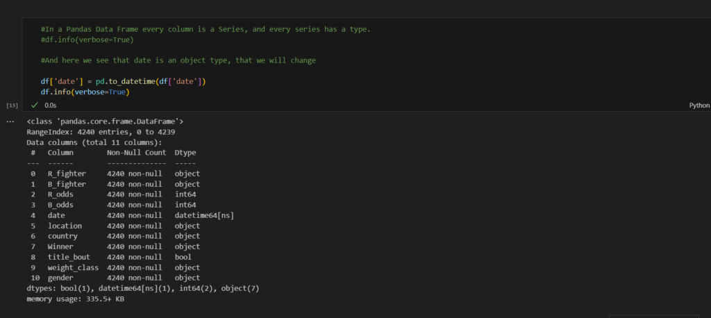
In the new output, we observe that the date column is now in datetime format. If any other column appears to be in the wrong data type, now would be a good time to change it. The process involves instantiating df['column_name'] and assigning a new condition to it, such as changing the data type of the column. Once the change is executed, it gets stored and modifies the dataframe.
We continue to utilize Pandas’ functionality to explore information about our dataset. I’m aiming for detailed explanations to solidify my personal knowledge. Feel free to skip to the main points if you prefer.
DataFrame.describe(percentiles=None, include=None, exclude=None)
(Generate descriptive statistics.)
(Descriptive statistics include those that summarize the central tendency, dispersion and shape of a dataset’s distribution, excludingNaNvalues.)
DataFrame.head(n=5)
Return the first n rows.This function returns the first n rows for the object based on position. It is useful for quickly testing if your object has the right type of data in it.
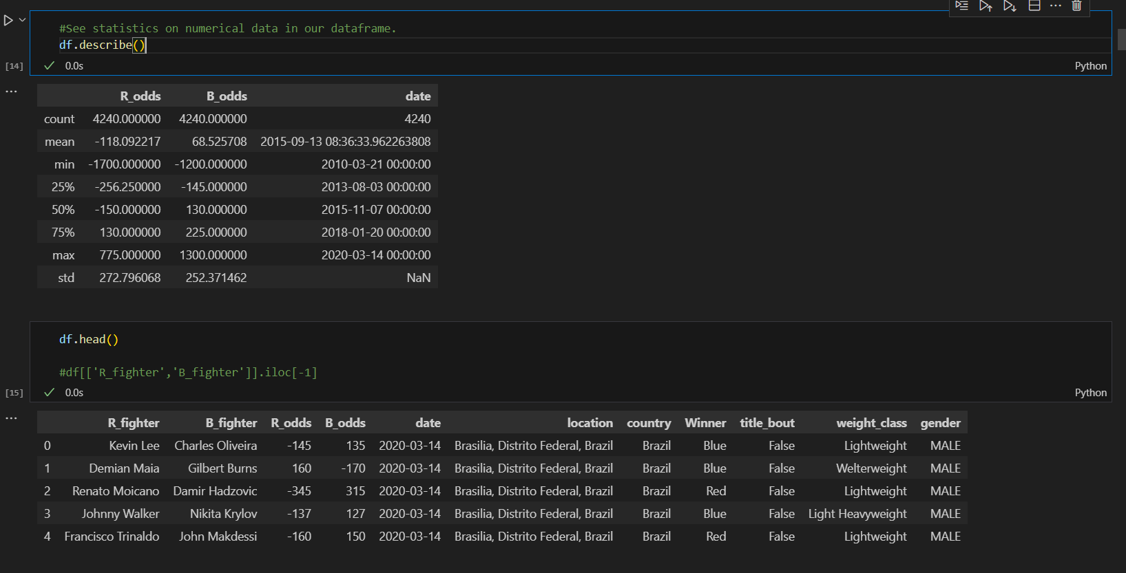
Brief description of the describe information:
Count number of non-NA/null observations.
Maximum of the values in the object.
Minimum of the values in the object.
Mean of the values.
Standard deviation of the observations.
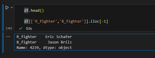
loc— gets rows (or columns) with particular labels from the index.iloc— gets rows (or columns) at particular positions in the index (so it only takes integers).
Step 5: Data Transformation
It’s rare to receive data in the exact form needed. Often, you’ll need to create new variables or summaries, or perhaps rename variables or reorder observations to make the data easier to work with.
Here, I’ve chosen to first select the columns I want in my dataframe. As you can see, I’ve kept all of them. However, if you find yourself with a dataframe containing unnecessary columns, simply make a copy of the dataframe with only the columns you need.

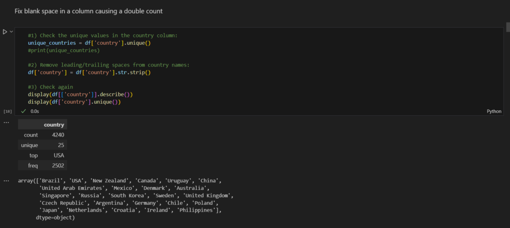
After defining my dataframe (df), I noticed some spelling mistakes in the “country” column, leading to double counting in some cases.
Here’s an example of how to address this: create a variable to store the unique countries from the “country” column of your dataframe, and then check if the number of unique countries matches what is expected.
To remove the errors, the process is similar. Access the column and assign the desired modification to it. For instance, using str.strip() removes leading or trailing blank spaces from the country names.
Series.str.strip(to_strip=None)-> Remove leading and trailing characters.
Strip whitespaces (including newlines) or a set of specified characters from each string in the Series/Index from left and right sides. Replaces any non-strings in Series with NaNs. Equivalent tostr.strip().
-Parameters:
to_strip: str or None, default None
Specifying the set of characters to be removed. All combinations of this set of characters will be stripped. If None then whitespaces are removed.
Handling missing values is a crucial step in the data cleaning process. Missing values can significantly impact the performance of data analysis and machine learning models, making it essential to address them effectively. There are several strategies to manage missing data, each with its advantages and disadvantages.
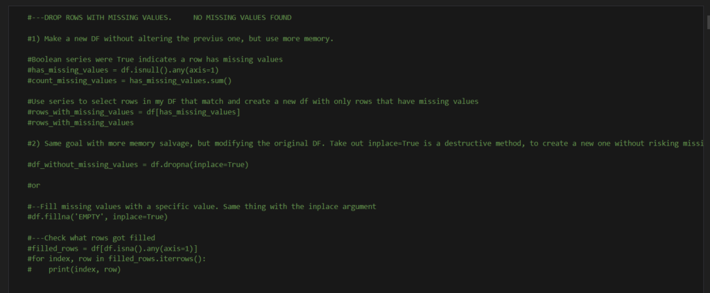
df.isnull()-> Detect missing values. [source]
df.any(*, axis=0, bool_only=False, skipna=True, **kwargs)-> Returns False unless there is at least one element within a series or along a Dataframe axis that is True or equivalent.[source]
df.sum(axis=0, skipna=True, numeric_only=False, min_count=0, **kwargs)-> Return the sum of the values over the requested axis.[source]
df.dropna(inplace=True)-> Remove missing values.
(inplace:bool, default False.Whether to modify the DataFrame rather than creating a new one.) [source]
df.fillna(‘EMPTY’, inplace=True)-> Fill NA/NaN values using the specified method. [source]
df.isna().any(axis=1)-> Detect missing values. [source]
df.iterrows()-> Iterate over DataFrame rows as (index, Series) pairs.[source]
After doing these practices, I felt like I had to make clear what I was doing and what is being used for. I believe it helps to build a strong foundation to associate actions with processes I can repeat in different scenarios.
Pros:
- Non-Destructive: It doesn’t alter the original df, which preserves the initial dataset for other operations.
- Isolation: It isolates rows with missing values, allowing targeted analysis or imputation strategies on just those rows.
Cons:
- Memory Usage: This method creates a new DataFrame, which can consume additional memory, especially with large datasets.
Pros:
- Simplicity: This is a straightforward method to remove rows with missing values.
- Efficiency: Reduces the dataset size, which can improve performance for subsequent operations.
Cons:
- Data Loss: Potentially significant loss of data if many rows contain missing values, which might not be ideal depending on the context.
Pros:
- Preservation: Maintains the DataFrame’s structure by keeping all rows, useful if every row contains important information.
- Flexibility: Allows specifying a meaningful fill value, which can be useful for further analysis.
Cons:
- Potential Misrepresentation: Filling with arbitrary values like ‘EMPTY’ could misrepresent the data if not carefully considered in the context of analysis or modeling.
Pros:
- Verification: Checking which rows were filled ensures transparency in the data cleaning process and helps verify the imputation’s impact.
Step 6: More Exploration
After performing transformations, I’ve decided to initiate a more structured exploration of the data I have. By examining each column individually, I can delve deeper into their respective purposes and identify what aspects I want to showcase through this exploration. This methodical approach allows for a thorough understanding of the dataset and enables me to highlight key insights effectively.
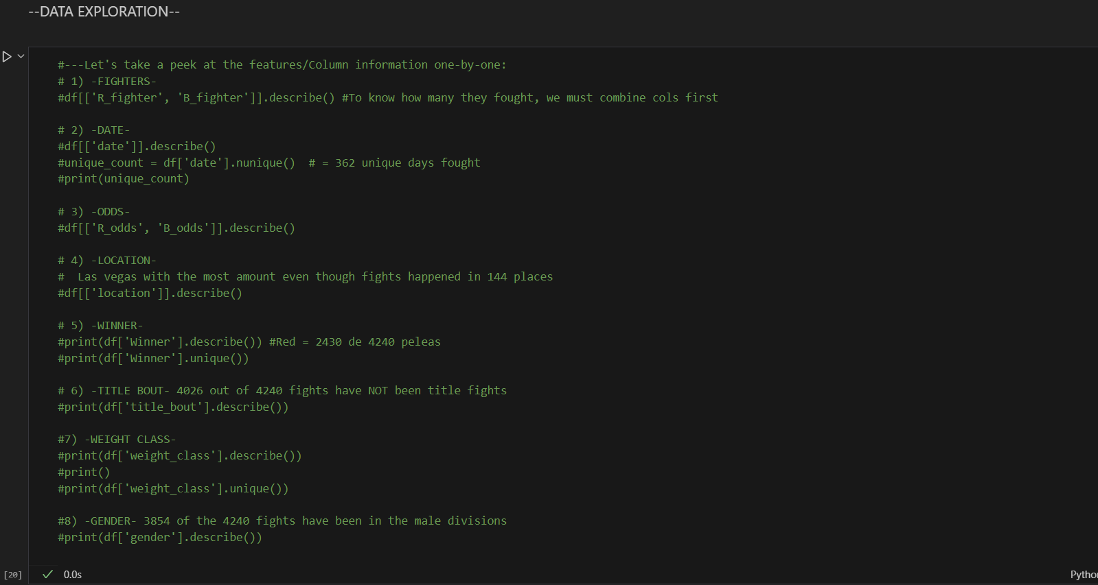
The approach is very simplistic, so feel free to give it your own take! Try working on one or two columns with help, whether it’s from the source code provided in Kaggle, this post, or the Pandas documentation. Then, try exploring the rest of the columns without any assistance. We have to build up our ability to handle things without reference or input from external sources.

Try this when doing follow ups...
When I was following the analysis done by users on Kaggle, I attempted to anticipate the information that needed to be analyzed before seeing it. I tried to guess which information I believed was necessary or relevant for the case. Some of my guesses were "wrong," while others were spot on. "Wrong" means that the information was not needed for the purpose of this analysis or could be relevant in a different context. Perhaps in a second iteration of the analysis, I will implement the insights from those "wrong" guesses.
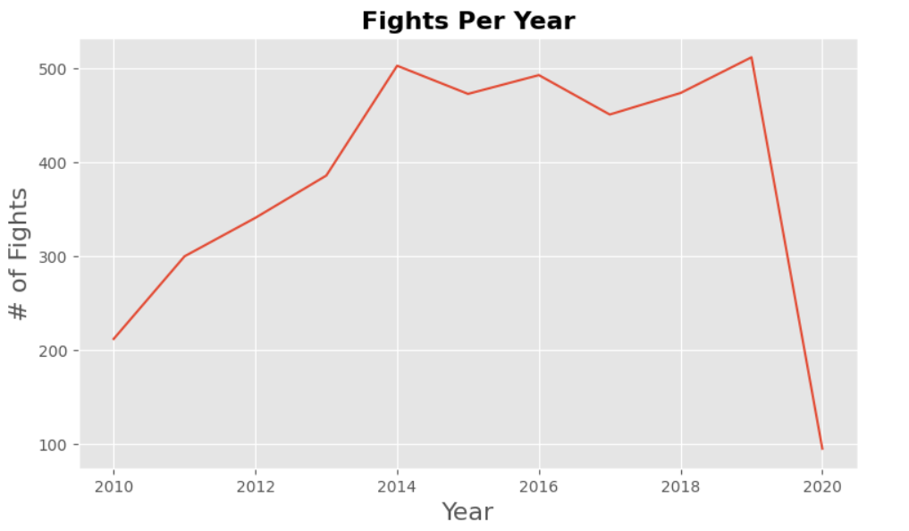
The goal is to take a look at how fights went during the years. By plotting the data early, we can identify trends early in the analysis. Sometimes this may mean information that was not being considered that is actually relevant.
To begin with, I create an empty list to fill it with the years labels from 2010 to 2021. There is no need to extract it directly from the data frame. Just by doing a for loop we can create the labels. Just check in the data frame when was the last and the first fight.
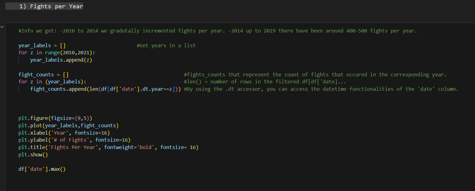
After this the idea is to create an empty list for the fight counts, meaning the number of fights that happened during each year. Using the list with the year labels that we created, we can do a for loop that iterates over the date column in the data frame. Pay attention of how the variable z is used to represent the year label that the loop is going through in that iteration.
Then we plot. Using matplotlib is relatively straightforward. Selecting the type of figure and its dimensions, what is it you are plotting (the two lists that we created) and assigning them to the x and y axis accordingly, you give it a title and then you plot it.
Starting to separate the analysis by gender. The approach is similar to what we did first. We create list where we assign values we want to analyze in the plot. One of them is going for the x axis and the other to y axis.
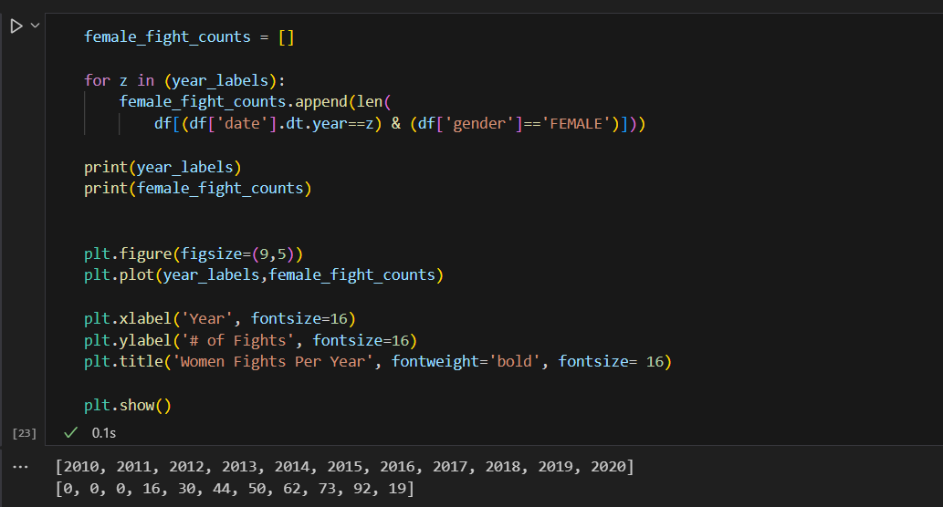
Check out the output where you can see how the two lists look, that is what we are looking for.
By reutilizing the years labels and making a for loop to extract fights with two conditions, the year label and the gender must be Female. When using append () in pandas we can specify more than one condition that has to be fulfilled in order for the information to be retrieved.
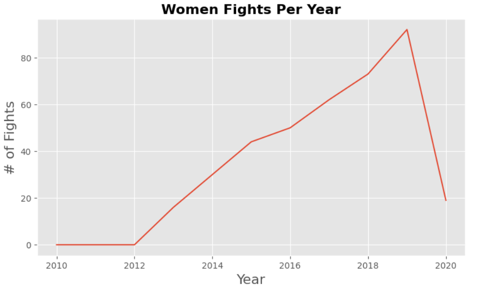
Basically, the same approach as with women. Try making this one on your own before copying the code.
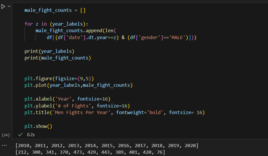
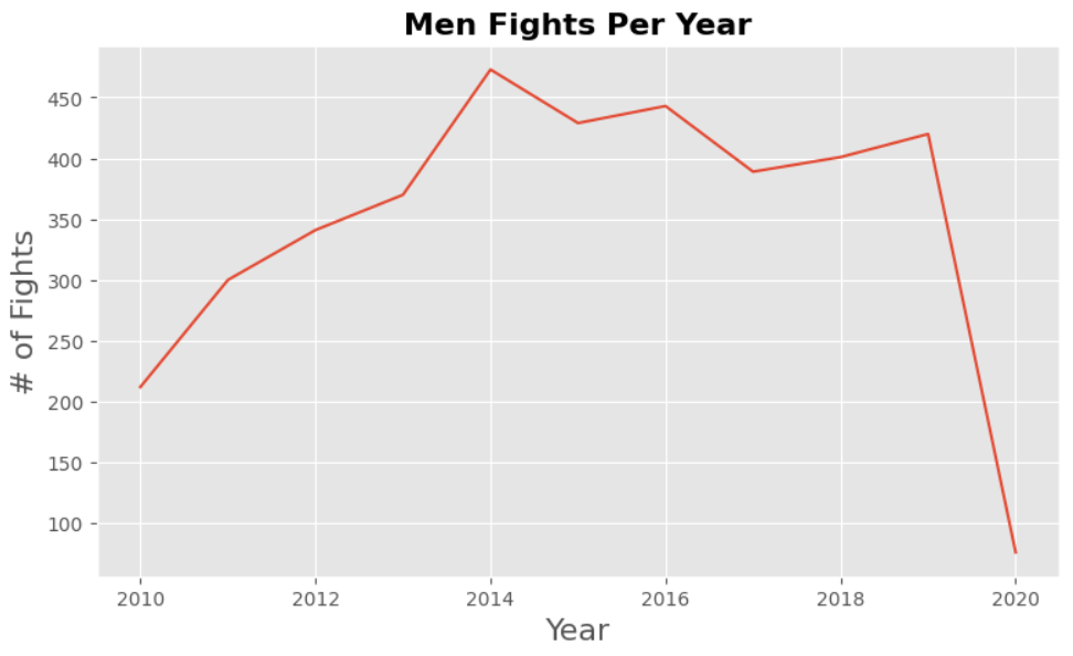
We can see a big dive by the end of the plot that is normal because there are no more records after 2020, and also covid happened so fights were slowed down.
What is an Underdog?
It is the way of calling the one fighter who won the match against the expectations of the betting odds. Fighters that come into a fight with a win streak have a higher possibility of winning the match than the ones that come in with a loss streak. It is importan to consider that the betting odds in UFC go both ways, it could be either positive or negative value. If you have a positive value, it means that you are more likely to lose, so if somebody bets at you the reward is higher that is why the number of your betting odd is higher. If you are more likely to win, then your betting odd number is l0wer as the price for winning a bet placed on you is lower.
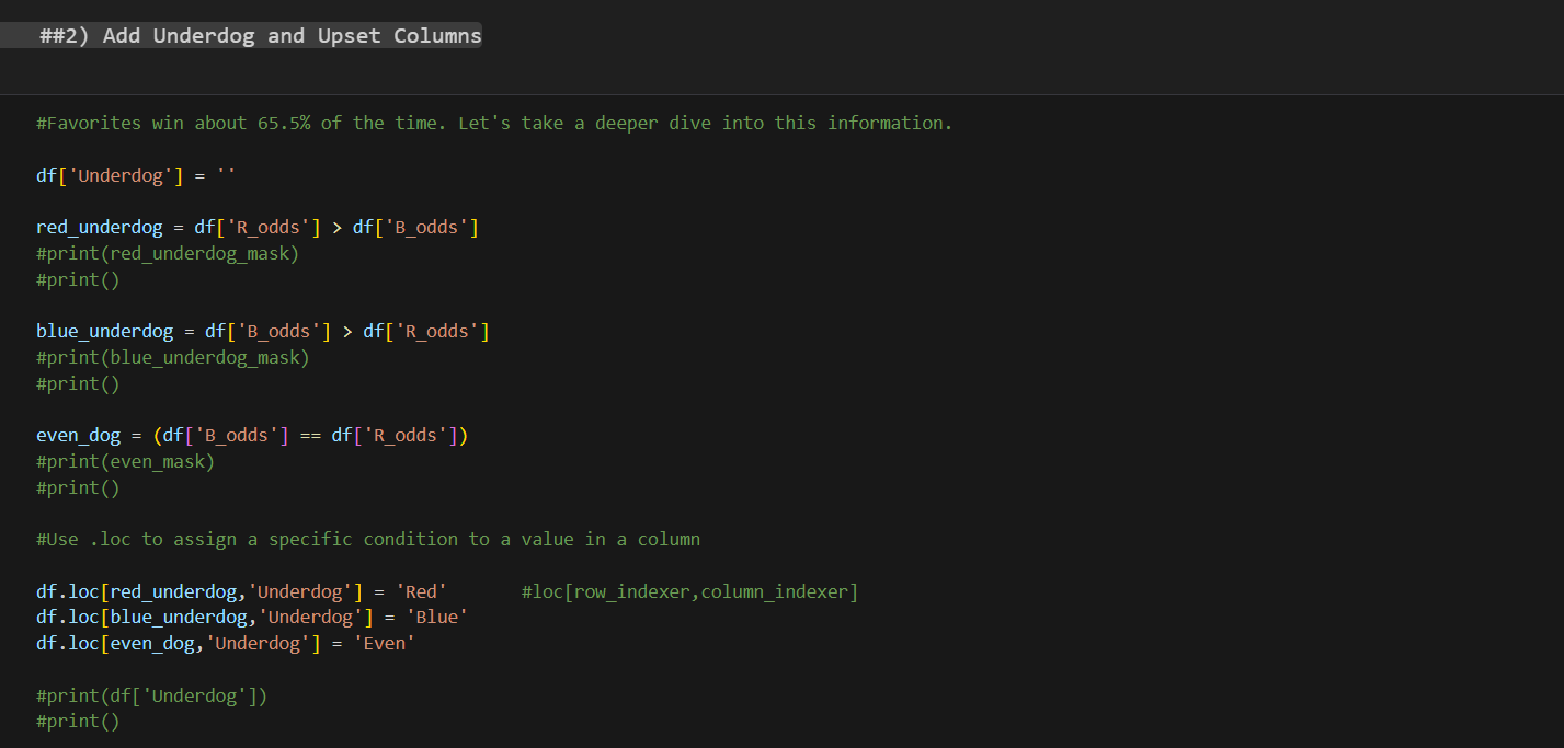
In order for us to add the information of who was an Underdog in each of the fights that took place in our data set, we first need to add the Underdog column.
Adding the underdog column
When we use the (“df[“column_name”] = ‘ ‘ ) we create a column in our data frame in this case empty, but if we wanted to,, we could add anything to it or specify the data type of the column. By default, the data type will be the one of the pieces of information we put in.
As we have two corners in the octagon, a red and blue corner, we have to first analyze and store values in variables:
- If the Red corner odds are higher than the Blue corner odds to win, then the Red Corner in that fight is the Underdog.
- If the Blue corner odds are higher than the Red corner odds, then the Blue corner is the Underdog in that fight.
- If the odds are even, we also want to know that and for it to be a separate value.
Now our data frame has a column with no values in it. So, we use the df.loc[] to assign a specific condition to a value in a column. Meaning we can use the variable we created as row indexers to access the column in the data frame where that condition is meet and assign a value to it, in this case “Red”, “Blue” and “Even”.
Adding the Upset column
What is better than proving everybody wrong? There is nothing that compares to a big turnaround of events, and in the UFC vocabulary we call that an Upset. When our Underdog fighters pull it out of the fire and wins the fight. Now we have a column with information on who was the Underdog on each fight, we can use that information and cross it with who won the fight to see if the fight was an Upset or not.
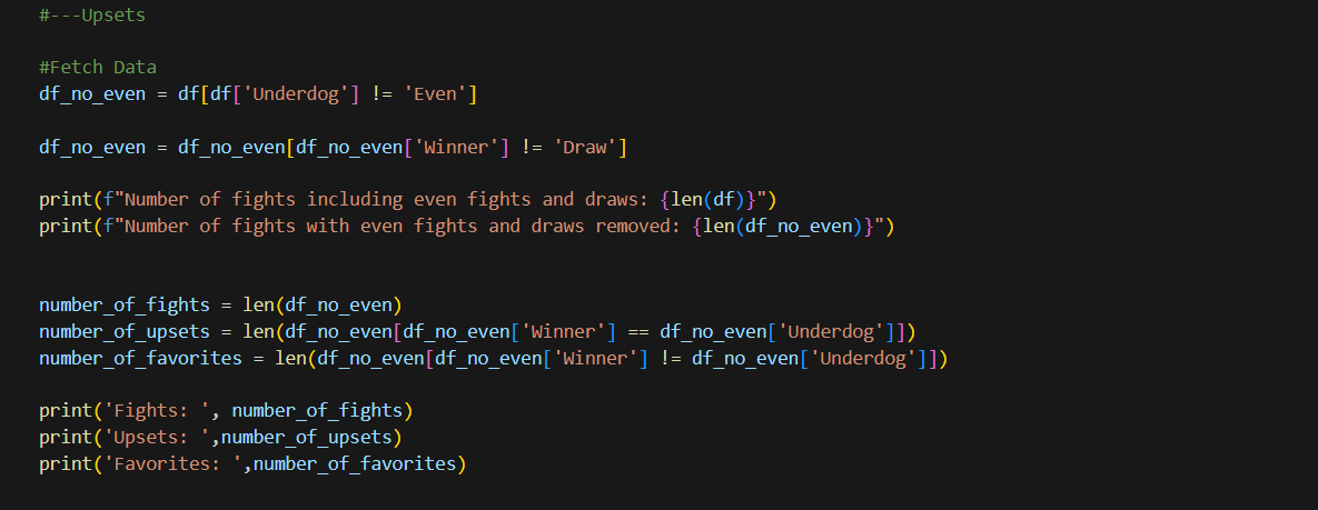
Starting by fetching the data and classifying it. We know that we have fights where their fight has been a draw. If we create a new data frame to manipulate information without worrying about the integrity if the original df is easier for us. So we extract the fights where the odds were not even first and then we also take out fights that ended as a draw. As none of this information is useful when trying to see if there was an Upset or not.
In the middle part, I use two prints to compare the length of my two df and see how much i took out.
It is useful to know how many fights we have in our new data frame so I store it in a variable. And then in a new variable I extract my data, instead of just asking for the length of the data frame, we can add a condition where we reduce our data frame to the fights where the Winner was an Underdog also. We do the same for the favorite fighter to win the fight and that is it, we have three variables with the number of fights, upsets in those fights and favorites.

How about if now we decide to use the data and get it ready for plotting in different ways?
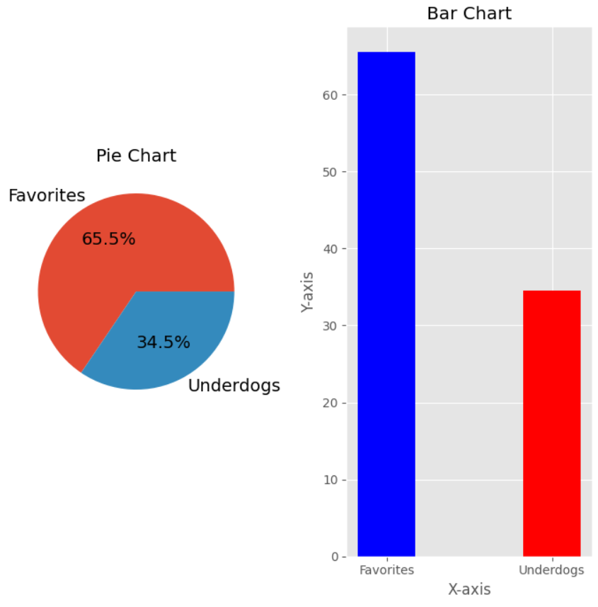
When beggining ploting of information first we have to make sure we have the data in the format that will display best and that we have the labels that are going to be shown in the plot. You can see how I first make the amount of upsets fights be represented as a percent of the total amount of fights, same thing for the favorite to win.

Creating a Customized Plot with Matplotlib: An In-depth Look

One of the fundamental steps in exploratory data analysis (EDA) using pandas is visualizing the data to uncover patterns and insights. The Matplotlib library is a powerful tool for this purpose. Let’s dissect a key line of code that sets up a customized plot: fig1, (ax1, ax2) = plt.subplots(1, 2, figsize=(9, 9)).
This line of code utilizes the plt.subplots function from Matplotlib to create a figure with two subplots arranged in a single row. Here’s a detailed breakdown of each component and its significance:
-
fig1: This variable represents the overall figure, which acts as a container for all the subplots, titles, labels, and other plot elements. The figure object controls the size and aesthetics of the entire plot.
-
(ax1, ax2): These variables represent the two axes objects that are created by
plt.subplots. Each axis object corresponds to a subplot within the figure. The axes are where the actual data visualization takes place, and they can be individually customized. Here,ax1will refer to the first subplot, andax2to the second subplot. -
plt.subplots(): This function is a convenient way to create multiple subplots in a single figure. The arguments passed to this function determine the layout and appearance of the subplots.
-
1, 2: These arguments specify the layout of the subplots. The first number indicates the number of rows, and the second number indicates the number of columns. In this case,
1, 2means that there will be one row with two columns, creating a side-by-side layout for the subplots. -
figsize=(9, 9): This parameter defines the size of the figure in inches. The figsize tuple specifies the width and height of the figure. A size of
(9, 9)creates a square figure with both dimensions being 9 inches. Adjusting the figure size can help in making the plots more readable and aesthetically pleasing.
-
By executing this line of code, you effectively prepare a canvas with two subplots arranged horizontally, ready to be populated with data visualizations. This setup is particularly useful when comparing two different datasets or visualizing different aspects of the same dataset side by side. Understanding each component of this line of code allows you to customize your plots efficiently, making your exploratory data analysis more effective and insightful.
So after specyfing the characteristics of our Pie Chart, our first subplot we then have to create our second subplot definition which is going to be a Bar Chart.
Creating and Customizing a Bar Chart in Matplotlib: A Step-by-Step Explanation
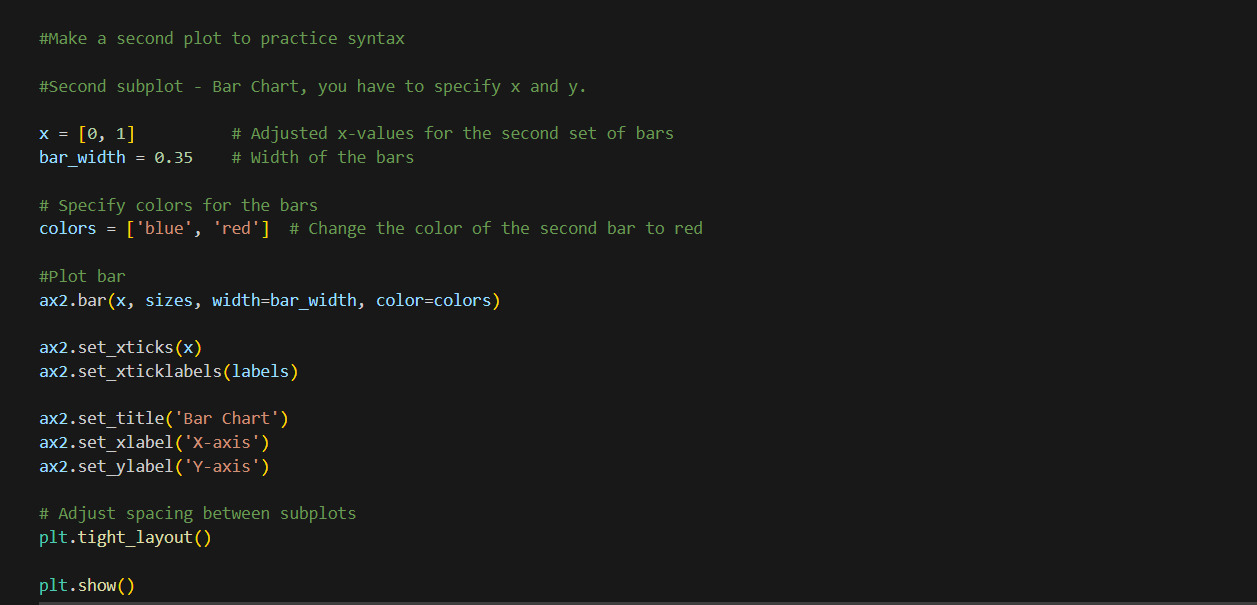
Let’s break down this code snippet step by step to understand how each component contributes to creating a bar chart:
First, we define the x-values and bar width. The list x = [0, 1] contains the x-coordinates for the bars, specifying the positions of two bars along the x-axis. The variable bar_width = 0.35 defines the width of each bar, ensuring moderate thickness.
Next, we specify the colors for the bars using the list colors = ['blue', 'red']. This means the first bar will be blue, and the second bar will be red, enhancing visual distinction between them.
To create the bar chart on the ax2 subplot, we use the ax2.bar() method. This method takes several parameters: x (the x-coordinates for the bars), sizes (the heights of the bars), width (the width of the bars), and color (the colors of the bars).
We then customize the x-axis by setting the positions of the ticks and assigning labels to them. The ax2.set_xticks(x) method sets the positions of the ticks on the x-axis to match the x-coordinates of the bars. The ax2.set_xticklabels(labels) method assigns labels to these ticks, with labels assumed to be a predefined variable containing the names corresponding to each bar.
Adding titles and labels to the plot is crucial for clarity. The ax2.set_title('Bar Chart') method sets the title of the subplot to “Bar Chart”. The ax2.set_xlabel('X-axis') and ax2.set_ylabel('Y-axis') methods label the x-axis and y-axis as “X-axis” and “Y-axis”, respectively.
Finally, to adjust the layout and display the plot, we use plt.tight_layout() and plt.show(). The plt.tight_layout() function adjusts the spacing between subplots to prevent overlap and ensure a cleaner layout. The plt.show() function displays the final figure with all its subplots.
Analyzing Yearly Rates: Insights from Year-over-Year Data
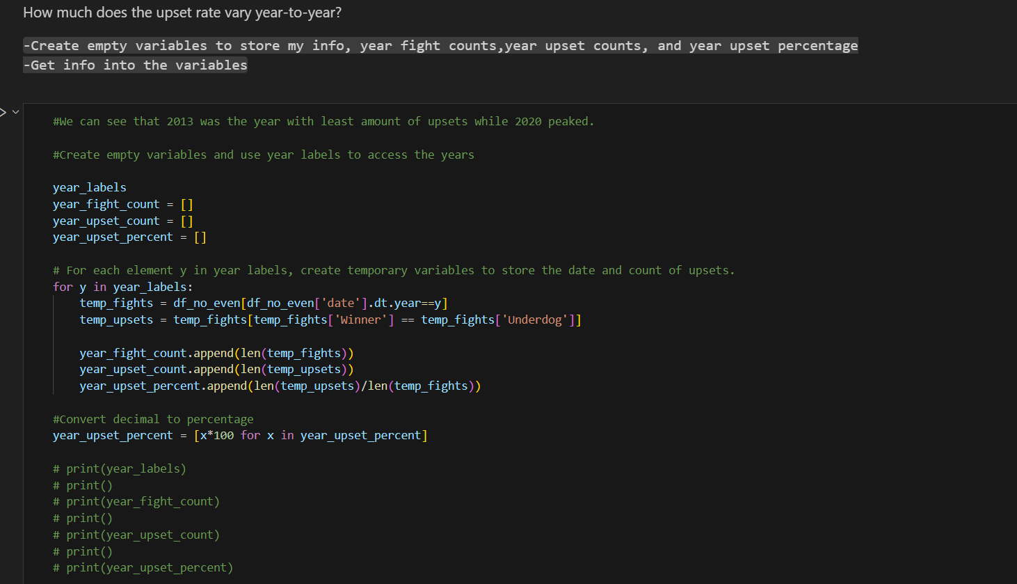
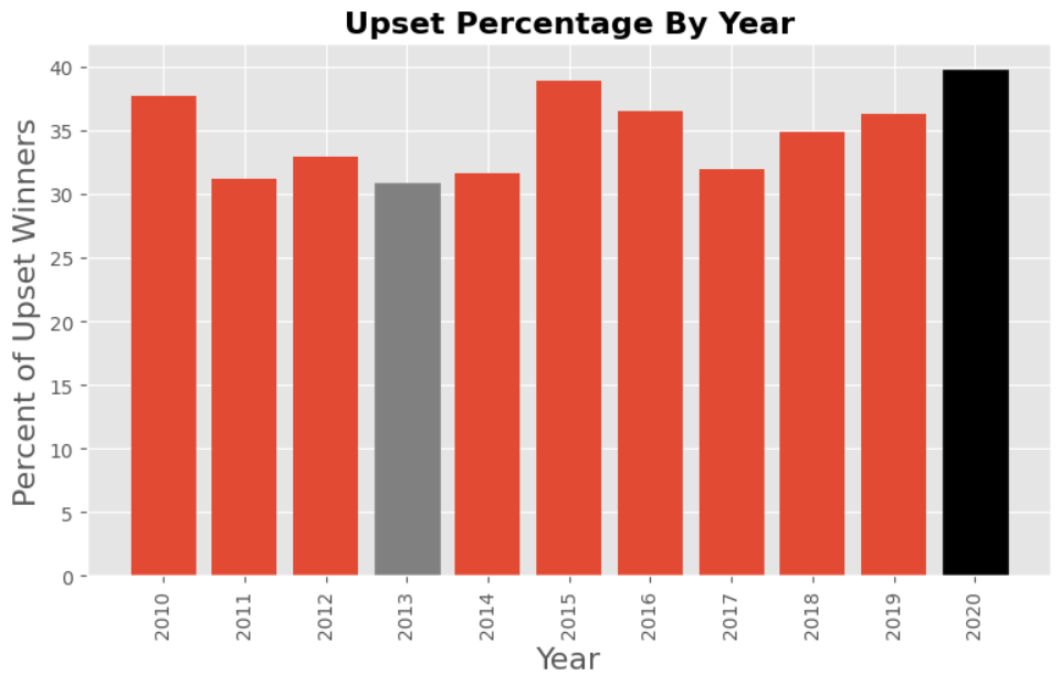
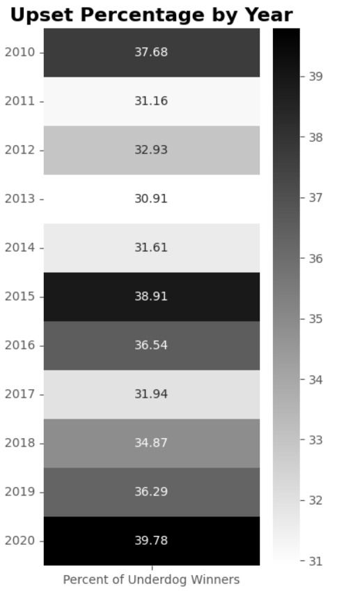
In exploratory data analysis, examining how certain metrics change year over year can provide valuable insights into trends, patterns, and anomalies. This approach allows us to identify significant shifts and understand underlying factors driving these changes. Below, we illustrate this concept using an example where we analyze the rate of upsets in fights each year, from the least amount of upsets in 2013 to a peak in 2020.
-
Defining Yearly Data Variables:
These lists are initialized to store the total number of fights, the number of upsets, and the percentage of upsets for each year, respectively.
-
Extracting and Calculating Yearly Data:
This loop iterates over each year in
year_labels, filters the dataset to include only fights from that year, and then further filters to find fights where the winner was the underdog. The total counts and upset counts are appended to their respective lists, and the percentage of upsets is calculated and stored. -
Converting Decimal to Percentage:
The upset percentages are converted from decimal to percentage for better readability.
-
Visualizing the Data:
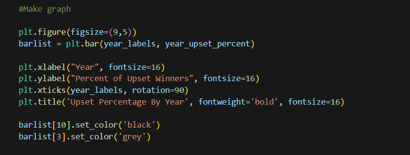
The bar chart is created with year labels on the x-axis and the percentage of upsets on the y-axis. The chart’s layout is adjusted for clarity, and specific bars are colored differently to highlight years with notable trends (e.g., 2013 and 2020).
Insights from Yearly Analysis
Analyzing the yearly rate of upsets in fights helps us uncover several important trends and insights:
-
Identifying Trends: By visualizing the upset percentages over multiple years, we can identify trends such as an increase or decrease in upsets. For instance, a peak in 2020 suggests a particularly unpredictable year in fights.
-
Highlighting Anomalies: Years with significantly lower or higher percentages of upsets, such as 2013 and 2020, stand out. These anomalies can prompt further investigation into what factors contributed to these deviations.
-
Understanding Context: Contextualizing data within specific years can reveal external factors affecting outcomes. For example, changes in fight regulations, training techniques, or even global events like the COVID-19 pandemic could impact the frequency of upsets.
-
Improving Predictive Models: Historical trends in upsets can be incorporated into predictive models to improve their accuracy. Understanding past behavior helps in forecasting future occurrences more reliably.
In summary, year-over-year analysis of rates, such as upset percentages in fights, provides a comprehensive view of trends, anomalies, and contextual factors. This approach is invaluable in exploratory data analysis, enabling data-driven insights and informed decision-making.
Introduction to Heatmaps and Seaborn
Heatmaps: An Overview
Heatmaps are a powerful data visualization tool used to represent data in a matrix format where individual values are displayed as colors. They are particularly useful for displaying the magnitude of data across two dimensions, making it easy to identify patterns, correlations, and anomalies at a glance.
When to Use Heatmaps:
- Trend Analysis: To observe trends over time or across different categories.
- Correlation Analysis: To highlight relationships between variables.
- Density Visualization: To show the density of data points in a given area, often used in geographic mapping.
Real-World Scenarios:
- E-commerce: Companies might use heatmaps to visualize customer interaction on their websites, identifying which areas receive the most clicks.
- Finance: Financial institutions might use heatmaps to analyze the correlation between different stocks or financial metrics.
- Healthcare: Hospitals might employ heatmaps to track the spread of diseases or the utilization of hospital resources over time.
Introduction to Seaborn
Seaborn is a high-level data visualization library in Python that is built on top of Matplotlib. It provides a range of functions for creating informative and attractive statistical graphics with less effort.
Uses of Seaborn:
- Statistical Plots: Seaborn simplifies the creation of complex statistical plots like bar plots, box plots, and violin plots.
- Data Relationships: It is particularly useful for exploring and understanding relationships between multiple variables.
- Customization: Seaborn offers extensive customization options to enhance the aesthetics and clarity of plots.
Common Applications:
- Exploratory Data Analysis (EDA): Seaborn is extensively used in EDA to uncover patterns and insights within the data.
- Machine Learning: Data scientists use Seaborn to visualize the results of machine learning models and to understand feature relationships.
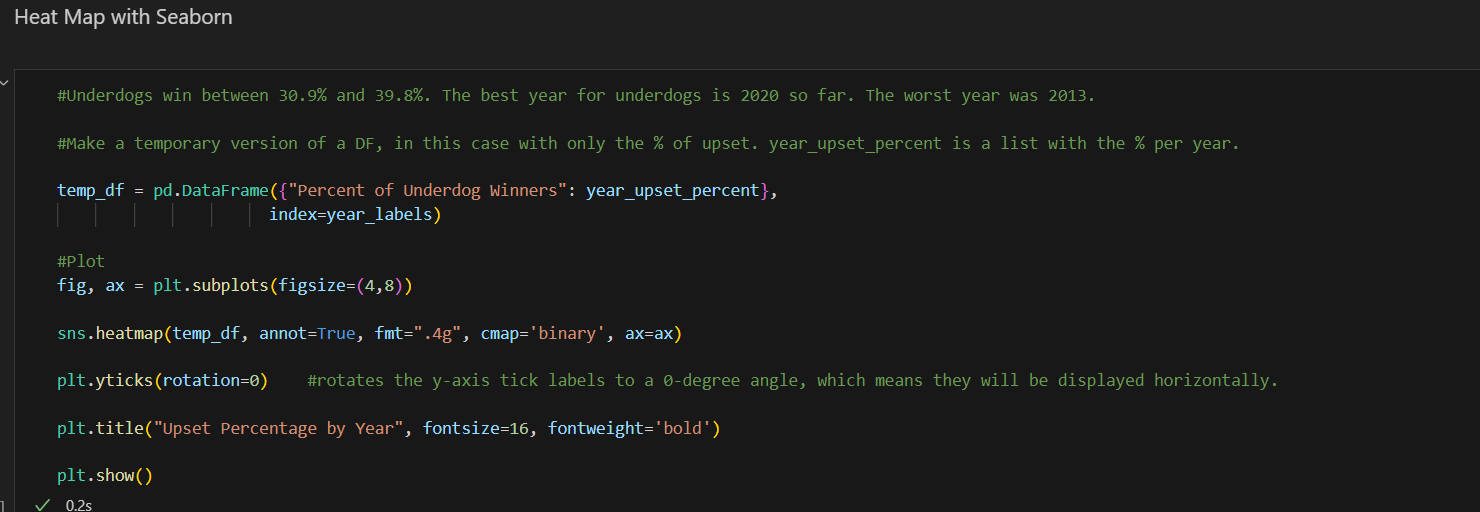
The following code creates a heatmap to visualize the percentage of underdog winners by year using Seaborn:
-
Creating a Temporary DataFrame:
- The
temp_dfDataFrame is created from a dictionary that maps the “Percent of Underdog Winners” to theyear_upset_percentlist, usingyear_labelsas the index. This DataFrame holds the percentage of upsets for each year.
- The
-
Plotting the Heatmap:
- A figure and axis are created using
fig, ax = plt.subplots(figsize=(4, 8)), setting the size of the plot. - The
sns.heatmapfunction is used to plot the heatmap. It takestemp_dfas input and annotates the heatmap with the actual values formatted to four significant figures usingfmt=".4g". The colormap is set to ‘binary’, and the plot is assigned to theaxaxis. - The
plt.yticks(rotation=0)function rotates the y-axis tick labels to a 0-degree angle, making them horizontal for better readability. - The plot is titled “Upset Percentage by Year” with a font size of 16 and bold font weight using
plt.title.
- A figure and axis are created using
-
Displaying the Plot:
- Finally,
plt.show()is called to render and display the heatmap.
- Finally,
Why We Need a Temporary DataFrame, Subplots, and Formatting with Significant Figures
Creating a Temporary DataFrame
In the context of visualizing data using Seaborn, creating a temporary DataFrame serves several key purposes:
-
Structured Data Handling:
- DataFrames provide a structured way to organize data, making it easier to manipulate and access specific subsets of data. By creating a DataFrame, we ensure that our data is well-organized, with labeled rows and columns that can be easily referenced.
-
Compatibility with Seaborn:
- Seaborn functions are designed to work seamlessly with pandas DataFrames. By converting our data into a DataFrame, we take advantage of Seaborn’s ability to directly interpret the DataFrame’s structure for plotting, which simplifies the code and enhances readability.
-
Indexing and Labeling:
- Using a DataFrame allows us to set meaningful indices and labels, which improves the clarity and interpretability of our plots. In this case, the years serve as indices, and the percentages of underdog winners are the values.
Why We Need Subplots
Creating subplots using fig, ax = plt.subplots(figsize=(4, 8)) is essential for several reasons:
-
Figure and Axis Control:
- Subplots provide a means to explicitly control the figure and axes objects. This control is crucial for customizing the plot’s appearance, such as setting the figure size, adjusting the layout, or adding multiple plots within a single figure.
-
Custom Plot Dimensions:
- Specifying the size of the plot (
figsize=(4, 8)) ensures that the heatmap has appropriate dimensions for visual clarity. This control over plot size is important for making sure that all elements (e.g., labels, titles) are clearly visible and properly spaced.
- Specifying the size of the plot (
-
Enhanced Plot Customization:
- By creating subplots, we gain access to the axis object (
ax), which allows for more detailed customization of the plot. For instance, setting the title, adjusting tick labels, and applying specific styles to the plot are all facilitated through the axis object.
- By creating subplots, we gain access to the axis object (
Formatting with Significant Figures using fmt=".4g"
When creating visualizations that include numerical annotations, it’s important to format these numbers for clarity and precision. The fmt=".4g" parameter in the sns.heatmap function specifies the formatting of the annotations:
-
Significant Figures:
- Formatting to four significant figures (
.4g) means that the numerical values will be displayed with up to four significant digits. This format adjusts the number of digits based on the magnitude of the number, ensuring that the most meaningful digits are shown.
- Formatting to four significant figures (
-
Clarity and Precision:
- Using significant figures provides a balance between precision and readability. For instance, a number like 0.123456 will be displayed as 0.1235, and a number like 12345 will be displayed as 1.235e4. This approach avoids overwhelming the viewer with excessive decimal places while still conveying the necessary precision.
-
Consistent Annotation:
- Applying a consistent format to all annotations in the heatmap ensures that the values are uniformly presented, making the plot easier to interpret and compare. This consistency is particularly important in visualizations where numerical differences are subtle but significant.
Analyzing Upset Percentages by Weight Class in Pandas
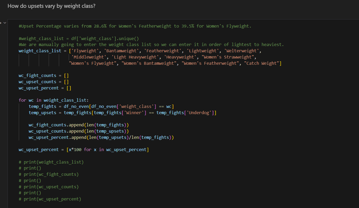
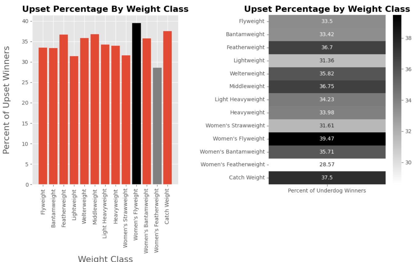
When analyzing data with pandas, especially in the context of exploratory data analysis (EDA), it is crucial to adopt efficient and logical approaches to handle and process data. The following code aims to calculate the percentage of upsets across different weight classes in mixed martial arts, highlighting the variation in upset percentages from 28.6% for Women’s Featherweight to 39.5% for Women’s Flyweight.
Code Explanation and Process Overview
The code provided calculates and visualizes the upset percentages for various weight classes. Here is a detailed explanation of the processes involved:
Weight Class List Initialization:
This list defines the weight classes manually, ensuring they are ordered from lightest to heaviest. While pandas can generate a unique list of weight classes automatically using df['weight_class'].unique(), manual ordering ensures logical and consistent categorization.
Initializing Lists for Data Storage:
These lists will store the total number of fights, the number of upsets, and the upset percentages for each weight class, respectively.
Loop Through Each Weight Class:
Filtering Data:
-For each weight class, the dataset is filtered to include only the fights within that weight class (temp_fights).
-Within this subset, another filter is applied to identify upsets, where the winner is also the underdog (temp_upsets).
Counting and Calculating Percentages:
-The total number of fights and the number of upsets are appended to their respective lists.
-The percentage of upsets is calculated and appended to wc_upset_percent.
Convert Percentages to Readable Format:
-This step converts the upset percentages from decimal format to a more readable percentage format.
Evaluating the Approach
The approach taken in this code is generally effective for calculating and analyzing upset percentages by weight class. However, there are some considerations and potential improvements to enhance efficiency and readability:
-
Use of Pandas GroupBy:
- Instead of looping through each weight class manually, leveraging pandas’
groupbymethod could simplify the process. Grouping by weight class and applying aggregation functions can streamline the calculation and reduce code verbosity.
- Instead of looping through each weight class manually, leveraging pandas’
-
Vectorized Operations:
- Pandas excels at handling vectorized operations, which are typically faster and more efficient than looping through DataFrame rows. Applying vectorized operations can improve performance, especially with larger datasets.
-
DataFrame Aggregation:
- Creating a DataFrame to store the aggregated results directly within the loop can make the code more concise and easier to manage.
Improved Approach
Here is an improved approach using groupby and aggregation functions:

Explanation of the Improved Approach
-
GroupBy and Apply:
- The
groupbymethod groups the DataFrame by the ‘weight_class’ column. - The
applymethod with a lambda function calculates the total fights, upsets, and upset percentages for each group, returning these as a Series.
- The
-
Reordering and Extraction:
- The
reindexmethod reorders the resulting DataFrame based on the predefined weight class list. - The necessary data lists are extracted using the
tolistmethod.
- The
By adopting this approach, we achieve the same results more efficiently and with cleaner, more readable code. This method leverages pandas’ powerful groupby and aggregation capabilities, providing a robust and scalable solution for analyzing upset percentages by weight class.
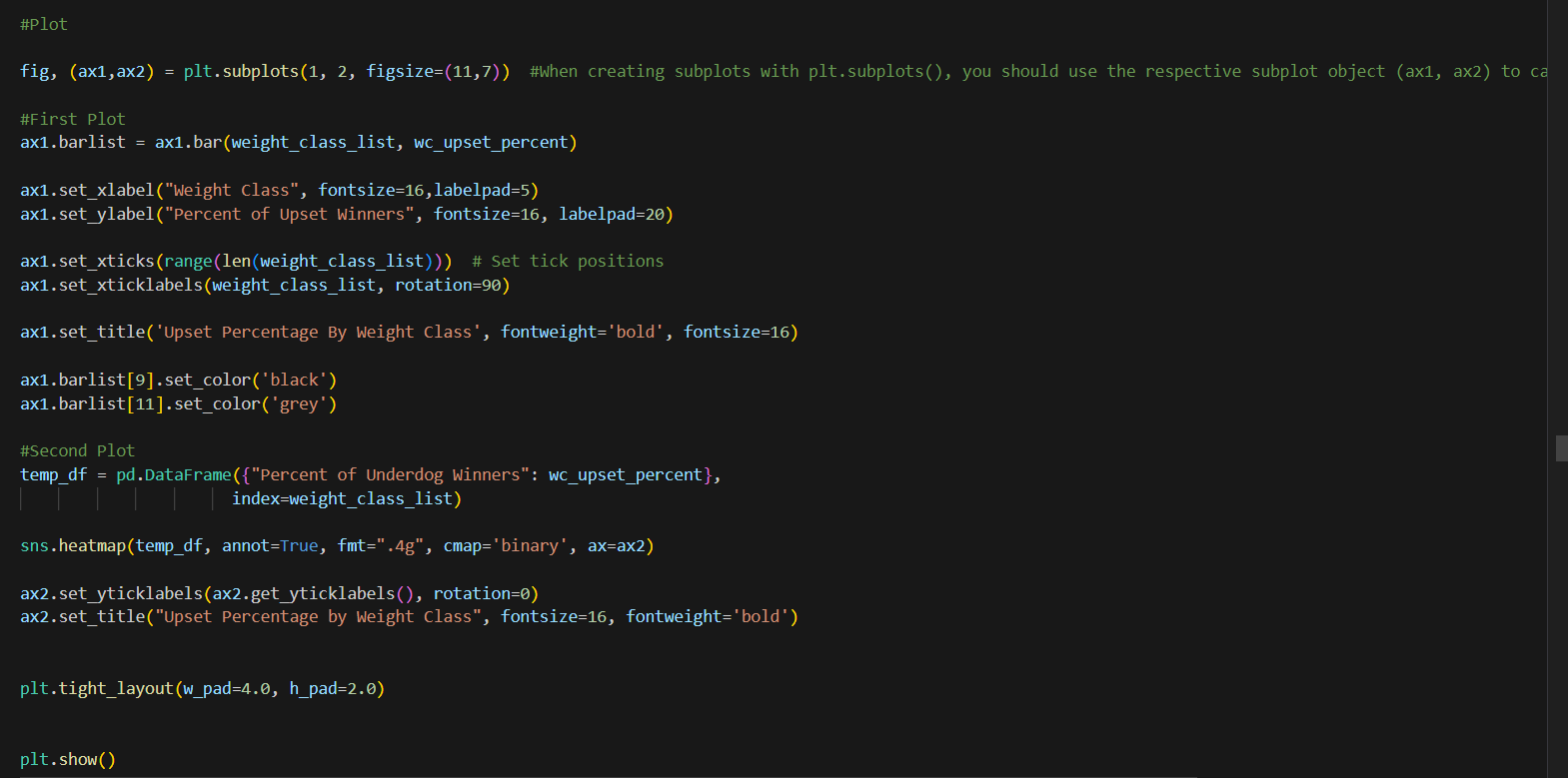
Now lets do the plots: We are basically using the same concepts as we did in past plots.
Analyzing Upsets by Gender in Pandas
Importance of Sorting Data by Gender
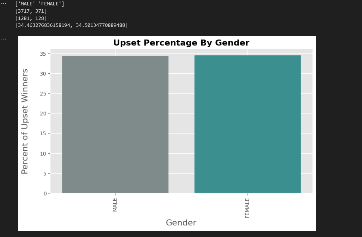
Sorting and analyzing data by gender allows us to understand how different groups perform relative to each other. In the context of upsets in mixed martial arts, this analysis can reveal whether there are any significant differences in the frequency of upsets between male and female fighters. Such insights can help in tailoring training programs, marketing strategies, and improving the overall understanding of gender dynamics in the sport.
Code Explanation and Process Overview
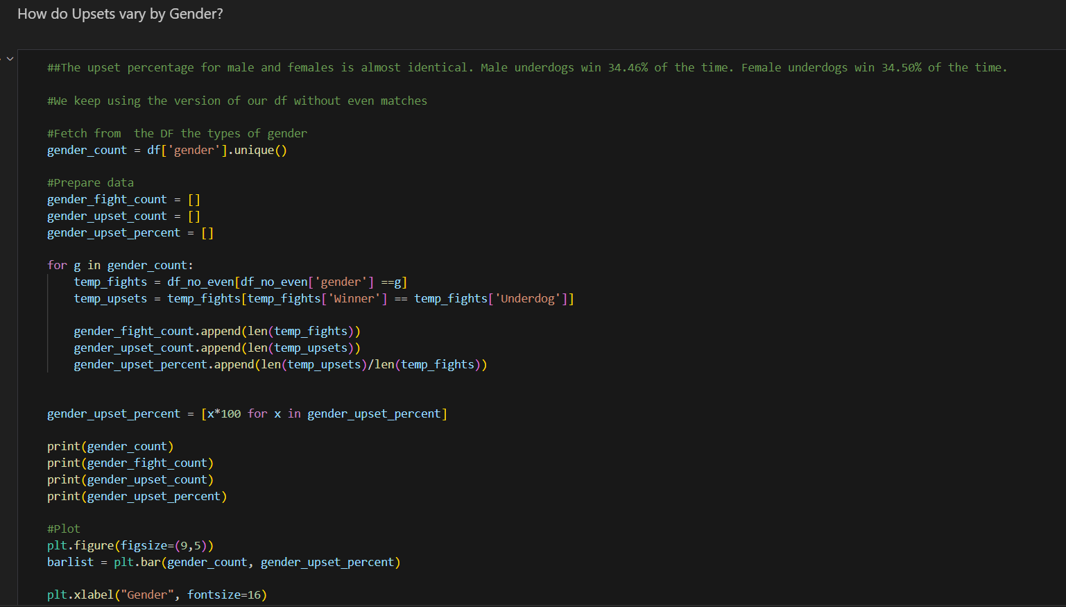
The provided code calculates and visualizes the percentage of upsets for male and female fighters using pandas. Here’s a step-by-step explanation of the processes involved:
-
Fetching Gender Types:
- The unique values from the ‘gender’ column of the DataFrame are retrieved, identifying the different genders present in the dataset.
-
Initializing Lists for Data Storage:
- Lists are initialized to store the total number of fights, the number of upsets, and the upset percentages for each gender, respectively.
-
Loop Through Each Gender:
- For each gender, the dataset is filtered to include only the fights involving that gender. Within this subset, another filter is applied to identify upsets, where the winner is also the underdog.
- The total number of fights and the number of upsets are appended to their respective lists. The percentage of upsets is calculated and appended to the upset percentages list.
-
Convert Percentages to Readable Format:
- The upset percentages are converted from decimal format to a more readable percentage format.
-
Print the Results:
- The unique genders, the total fight counts, the upset counts, and the upset percentages are printed for verification.
-
Plot the Results:
- A new figure is initialized for the bar chart with specified dimensions. The upset percentages for each gender are plotted using a bar chart.
- The plot is customized with labels, title, and colors to enhance readability and aesthetics. Finally, the plot is rendered and displayed.
Analyzing Upsets by Title Bout Status in Pandas
Importance of Sorting Data by Title Bout Status
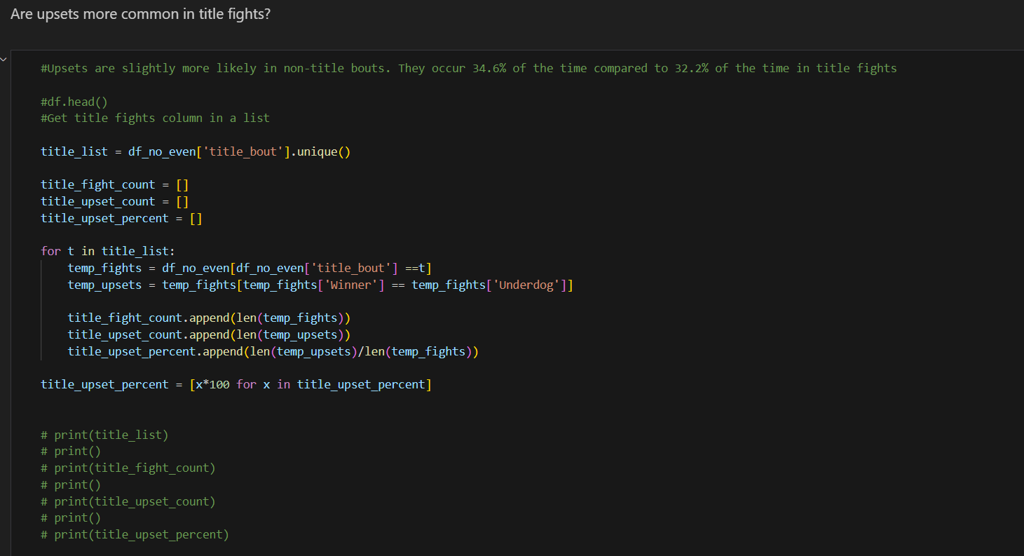
Sorting and analyzing data by title bout status allows us to understand how the stakes of a fight might influence the likelihood of upsets. In this context, the analysis reveals that upsets are slightly more common in non-title bouts (34.6%) compared to title fights (32.2%). Understanding this can provide valuable insights for trainers, analysts, and bettors, and it can influence strategies and preparations for different types of bouts.
Code Explanation and Process Overview
The provided code calculates and visualizes the percentage of upsets for title and non-title bouts using pandas. Here’s a detailed explanation of the processes involved:
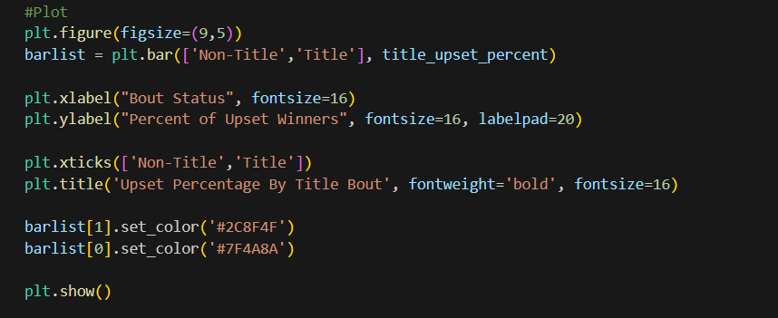
-
Fetching Title Bout Types:
- The unique values from the ‘title_bout’ column of the DataFrame are retrieved, identifying whether the fight is a title bout or not.
-
Initializing Lists for Data Storage:
- Lists are initialized to store the total number of fights, the number of upsets, and the upset percentages for title and non-title bouts, respectively.
-
Loop Through Each Bout Type:
- For each bout type (title or non-title), the dataset is filtered to include only the fights of that type. Within this subset, another filter is applied to identify upsets, where the winner is also the underdog.
- The total number of fights and the number of upsets are appended to their respective lists. The percentage of upsets is calculated and appended to the upset percentages list.
-
Convert Percentages to Readable Format:
- The upset percentages are converted from decimal format to a more readable percentage format.
-
Print the Results:
- The unique bout types, the total fight counts, the upset counts, and the upset percentages are printed for verification.
-
Plot the Results:
- A new figure is initialized for the bar chart with specified dimensions. The upset percentages for each bout type are plotted using a bar chart.
- The plot is customized with labels, title, and colors to enhance readability and aesthetics. Finally, the plot is rendered and displayed.
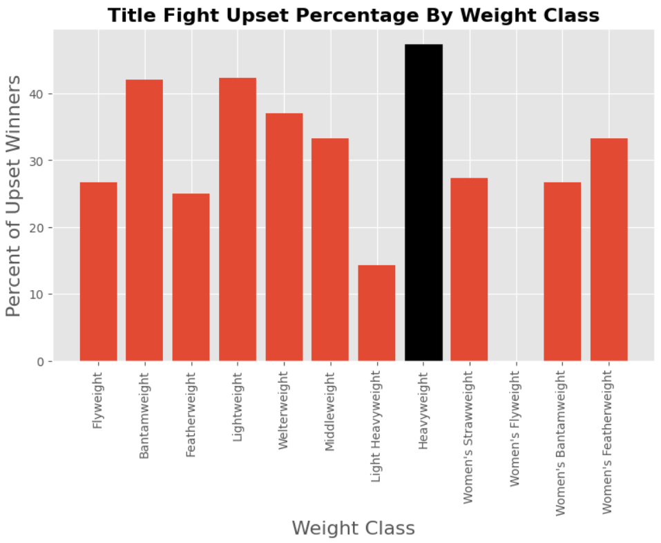
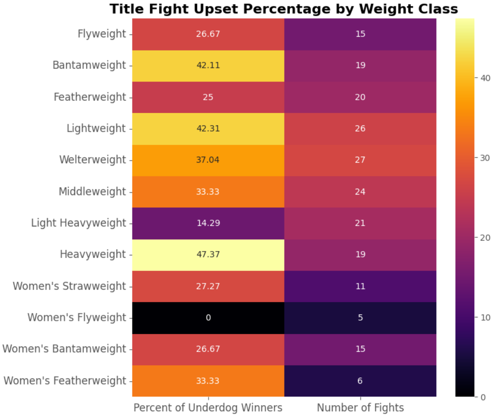
Analyzing Upsets in Title Bouts by Weight Class
Introduction
In this section, we investigate whether upsets are more likely in certain weight class title bouts. Despite potential challenges posed by small sample sizes in some weight classes, exploring this aspect can reveal interesting insights and anomalies that may influence fighters’ strategies and perceptions within the sport.
Code Explanation and Process Overview
The provided code partitions the DataFrame to include only title bouts (df_title) and then calculates and visualizes the percentage of upsets for each weight class title bout. Here’s a breakdown of the processes involved:
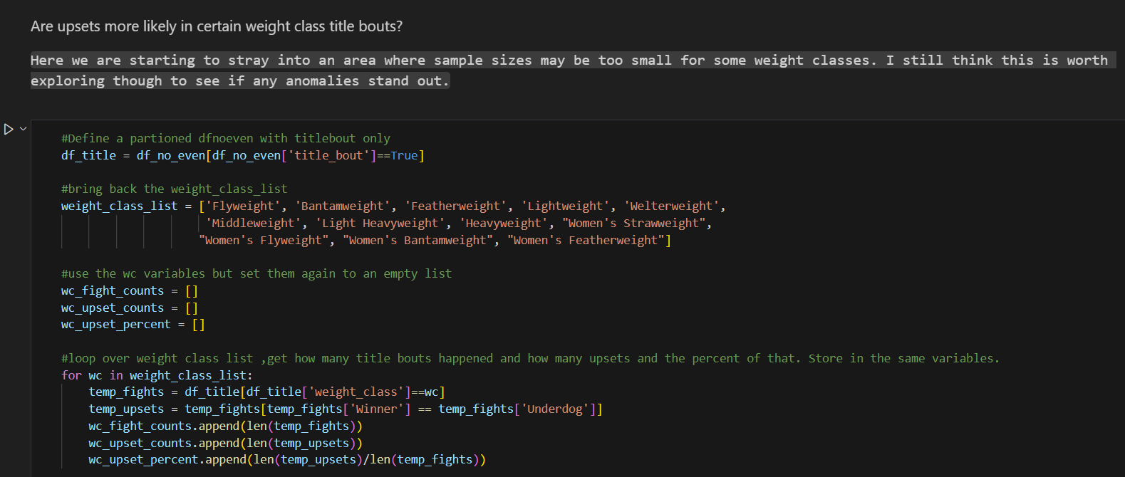

-
Partitioning DataFrame for Title Bouts:
- A partitioned DataFrame (
df_title) is created, filtering only the rows where the ‘title_bout’ column is True.
- A partitioned DataFrame (
-
Defining Weight Class List:
- The predefined list of weight classes (
weight_class_list) is reintroduced.
- The predefined list of weight classes (
-
Initializing Lists for Data Storage:
- Lists are initialized to store the total number of title fights, the number of upsets, and the upset percentages for each weight class, respectively.
-
Loop Through Each Weight Class:
- For each weight class, the DataFrame of title bouts is filtered to include only fights of that weight class (
temp_fights). - Within this subset, another filter is applied to identify upsets, where the winner is also the underdog (
temp_upsets). - The total number of title fights and the number of upsets are appended to their respective lists. The percentage of upsets is calculated and appended to the upset percentages list.
- For each weight class, the DataFrame of title bouts is filtered to include only fights of that weight class (
-
Convert Percentages to Readable Format:
- The upset percentages are converted from decimal format to a more readable percentage format.
-
Plot the Results:
- A new figure is initialized for the bar chart with specified dimensions. The upset percentages for each weight class title bout are plotted using a bar chart.
- The plot is customized with labels, title, and colors to enhance readability and aesthetics. Finally, the plot is rendered and displayed.
Evaluating the Approach
The approach taken in this code provides valuable insights into the likelihood of upsets across different weight class title bouts. However, it’s important to acknowledge the potential limitations associated with small sample sizes, particularly in less common weight classes. Despite this, exploring the data can still reveal trends and anomalies that may inform decision-making in the sport.
Conclusion
Analyzing upsets in title bouts by weight class offers a nuanced understanding of the dynamics within mixed martial arts. By considering both statistical trends and contextual factors, stakeholders can make informed decisions regarding training, strategy, and match promotion. This analysis underscores the multifaceted nature of competitive sports and the importance of data-driven insights in optimizing performance and engagement.
Bonus:

Identifying Locations with the Most Upsets Since 2010
Introduction
In this section, we aim to determine the locations that have witnessed the most upsets in mixed martial arts events since 2010. By analyzing event data and identifying locations where underdog victories are prevalent, we gain insights into the competitive landscape of the sport and potentially uncover trends or anomalies in specific regions.
Code Explanation and Process Overview
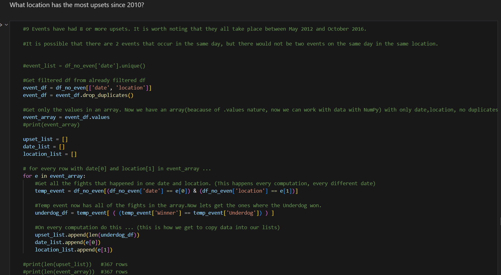
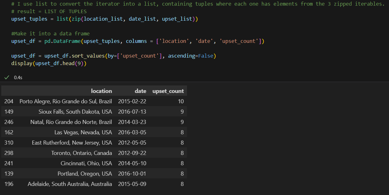
The provided code processes event data to identify locations with the highest number of upsets since 2010. Here’s a breakdown of the processes involved:
-
Fetching Event Data:
- A DataFrame (
event_df) containing unique combinations of event dates and locations is extracted from the pre-filtered DataFrame (df_no_even). This ensures that each event is considered only once, eliminating duplicates and even matches.
- A DataFrame (
-
Initializing Lists for Data Storage:
- Lists are initialized to store the number of upsets, event dates, and locations for each event.
-
Loop Through Each Event:
- For each event in the event DataFrame, the corresponding subset of fights is extracted based on the event date and location. This subset represents all fights that occurred at that particular event.
- Within this subset, another filter is applied to identify fights where the underdog emerged victorious.
- The number of upsets for the event, along with its date and location, is appended to the respective lists.
-
Creating Tuples and DataFrame:
- The lists of locations, dates, and upset counts are zipped together to create tuples, where each tuple represents an event with its associated data.
- These tuples are then converted into a DataFrame (
upset_df) with columns for location, date, and upset count.
-
Sorting and Displaying Results:
- The DataFrame is sorted in descending order based on the number of upsets, revealing the locations with the highest upset counts since 2010.
- The top 9 locations with the most upsets are displayed.
Observations
- The analysis reveals that 9 events stand out with 8 or more upsets each.
- Notably, these events all took place between May 2012 and October 2016, suggesting a concentrated period of unpredictability in certain locations.
- The identified locations provide valuable insights for further investigation into factors contributing to the prevalence of upsets, such as venue characteristics, fighter demographics, or match dynamics.
Conclusion
Analyzing locations with the most upsets in mixed martial arts events offers valuable insights into the competitive dynamics of the sport. By understanding where underdog victories are more common, stakeholders can tailor strategies, promotions, and training regimens to better navigate the complexities of the MMA landscape. This analysis underscores the importance of data-driven insights in optimizing performance and engagement within the sport.
Analyzing Upsets by Country
Introduction
In this section, we delve deeper into the analysis of upsets by examining their occurrence at both the country and city levels. By studying the prevalence of upsets in different geographical regions, we aim to identify patterns and variations that may provide valuable insights into the dynamics of mixed martial arts competitions.
Analyzing Upsets by Country
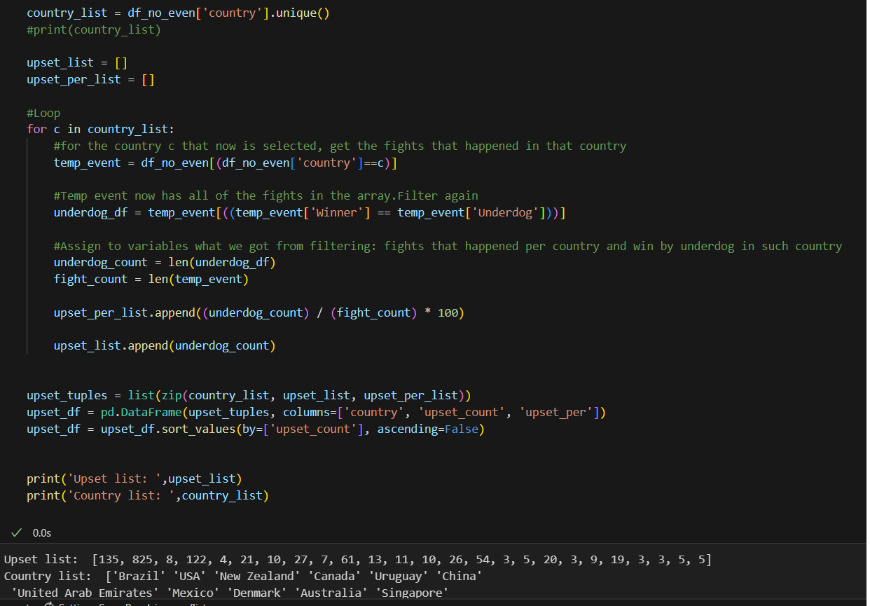
We start by analyzing upsets on a country level. The provided code processes event data to calculate the total number of upsets and the percentage of upsets for each country. Here’s an overview of the process:

-
Fetching Country Data:
- A list (
country_list) containing unique country names extracted from the pre-filtered DataFrame (df_no_even).
- A list (
-
Initializing Lists for Data Storage:
- Lists (
upset_listandupset_per_list) initialized to store the total number of upsets and the percentage of upsets for each country, respectively.
- Lists (
-
Loop Through Each Country:
- For each country in the country list, the corresponding subset of fights that occurred in that country is extracted from the DataFrame.
- Within this subset, another filter is applied to identify fights where the underdog emerged victorious.
- The total number of upsets and the percentage of upsets relative to the total number of fights in the country are calculated and stored in the respective lists.
-
Creating Tuples and DataFrame:
- The lists of country names, upset counts, and upset percentages are zipped together to create tuples.
- These tuples are then converted into a DataFrame (
upset_df) with columns for country, upset count, and upset percentage.
-
Sorting and Displaying Results:
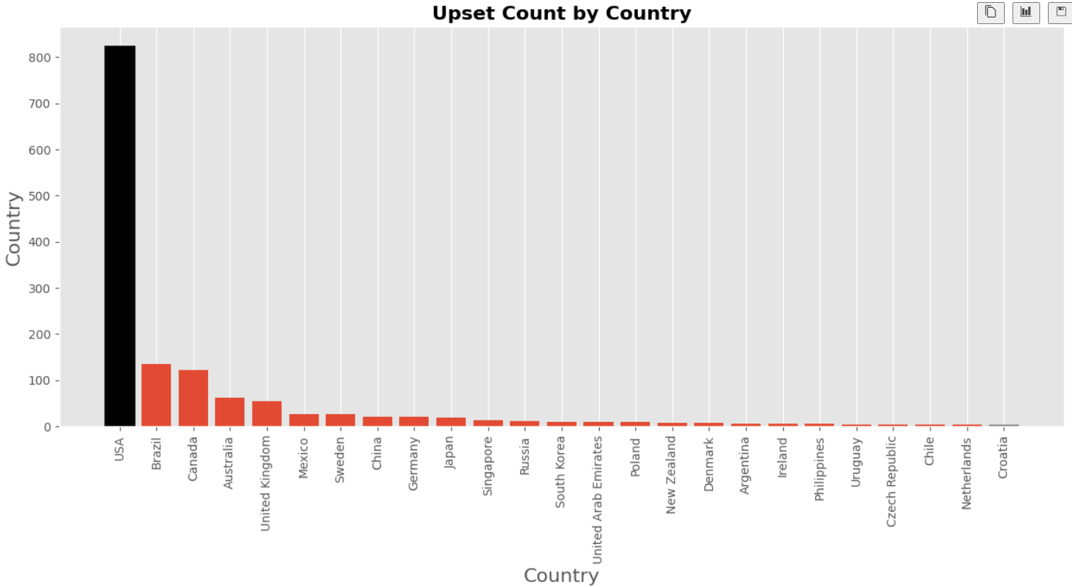
- The DataFrame is sorted in descending order based on the number of upsets, highlighting countries with the highest upset counts.
- The results are printed for further analysis.

Visualizing Upset Percentage
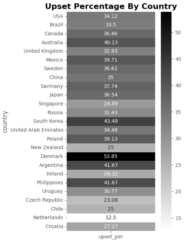
The provided code generates a heatmap to visualize the upset percentage by country. Here’s an overview of the process:
-
Filtering Data:
- The DataFrame (
upset_df) is filtered to retain only the columns for country and upset percentage (upset_per).
- The DataFrame (
-
Setting Index:
- The country column is set as the index of the DataFrame for easier visualization.
-
Creating Heatmap:
- A heatmap is generated using Seaborn’s
heatmapfunction. The data is annotated with the upset percentages and formatted to display four significant figures (fmt=".4g"). - The colormap
binaryis used to emphasize variations in upset percentages.
- A heatmap is generated using Seaborn’s
-
Customizing Visualization:
- The y-axis tick labels are rotated for improved readability.
- A title is added to the plot to provide context and emphasize its significance.
Observations
- The heatmap effectively highlights the variation in upset percentages across different countries.
- Countries are arranged by upset count, with higher upset counts appearing towards the top of the heatmap.
- The visualization reveals interesting patterns, such as the significant lack of upsets in the United Kingdom and the comparatively higher upset percentage in Australia.

Closing Argument: Understanding the Competitive Landscape of Mixed Martial Arts
In the realm of mixed martial arts (MMA), where every fight is a testament to skill, strategy, and determination, understanding the competitive landscape is paramount. Throughout this article, we have embarked on a journey to dissect the intricacies of MMA competitions, from analyzing upsets to exploring their geographical distribution.
We began by unraveling the phenomenon of upsets, uncovering patterns and trends that shed light on the dynamics of underdog victories. From analyzing upsets by weight class to delving into the influence of title bout status and gender, we have gained valuable insights into the factors that shape the outcomes of MMA fights.
Through comprehensive data analysis and visualization, we have painted a vivid picture of the competitive landscape of MMA, empowering stakeholders to navigate its complexities with confidence and foresight. From trainers and fighters seeking to optimize their performance to analysts and bettors aiming to make informed decisions, the insights gleaned from our exploration offer valuable guidance in the pursuit of success in the world of mixed martial arts.
As the sport continues to evolve and captivate audiences around the globe, our commitment to understanding its intricacies remains steadfast. By embracing data-driven insights and leveraging the power of analysis and visualization, we stand at the forefront of unraveling the mysteries of MMA, enriching our understanding of its competitive dynamics, and shaping its future with knowledge and expertise. Together, let us embark on this journey of exploration and discovery, as we unravel the secrets of success in the exhilarating world of mixed martial arts.



of course like your website but you have to check the spelling on several of your posts A number of them are rife with spelling issues and I in finding it very troublesome to inform the reality on the other hand I will certainly come back again
Hi Molly,
Thank you for your comment! I understand, and I am still going through a phase where I want to build up my articles before going through stages of grammar correction and improving readability. Your feedback is greatly appreciated, and I promise my work will only improve!